Graphs of the electricity generation statistics gathered from our solar PV generation system, 2015.
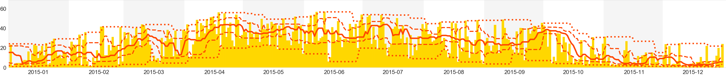
Our daily power generation in kWh (bars), along with minimum (dot-dashed), lower quartile (dashed), median (solid), upper quartile (dashed), maximum (dot-dashed) running averages over the previous 14 day sliding window.
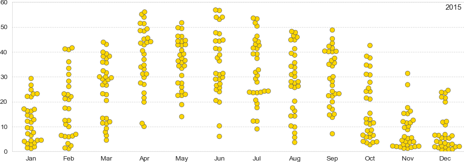
Our daily power generation in kWh, per month, using a jitter plot (some jitter is applied to the horizontal position, to prevent overlapping).
Our daily power generation in kWh, per month, using violin plots (a notched box and whisker plot—where the box shows the inter-quartile range, with 95% confidence interval notches; whiskers show data within 1.5*IQR—plus a kernel density plot). The final, partial, month tends to have larger notches, because it has less data.

The vertical time axis runs from 3:00am to 9:00pm GMT. There is one column of data per day. Data is gathered every 5 minutes.
Each pixel represents the energy generation at the sample point. The colour indicates the energy generation in the relevant interval: darker colours indicate more energy.
Each pixel represents the cumulative energy generation at the sample point, normalised for the day. This shows whether the generation was mostly in the morning, the afternoon, or evenly distributed over the day.

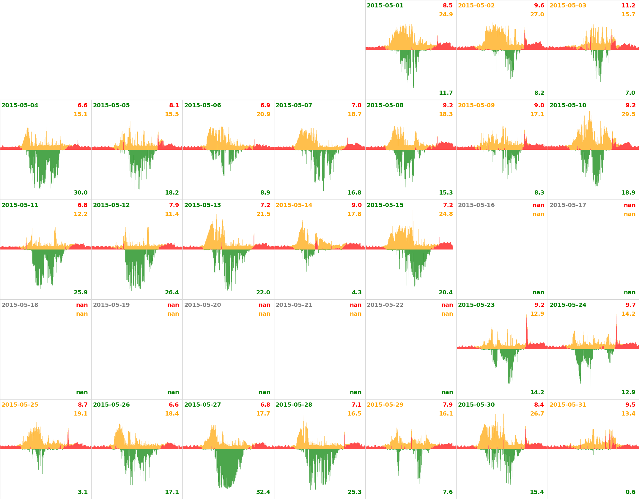
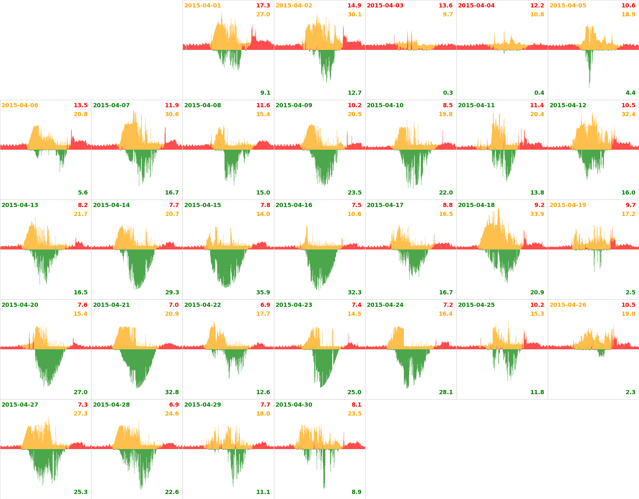
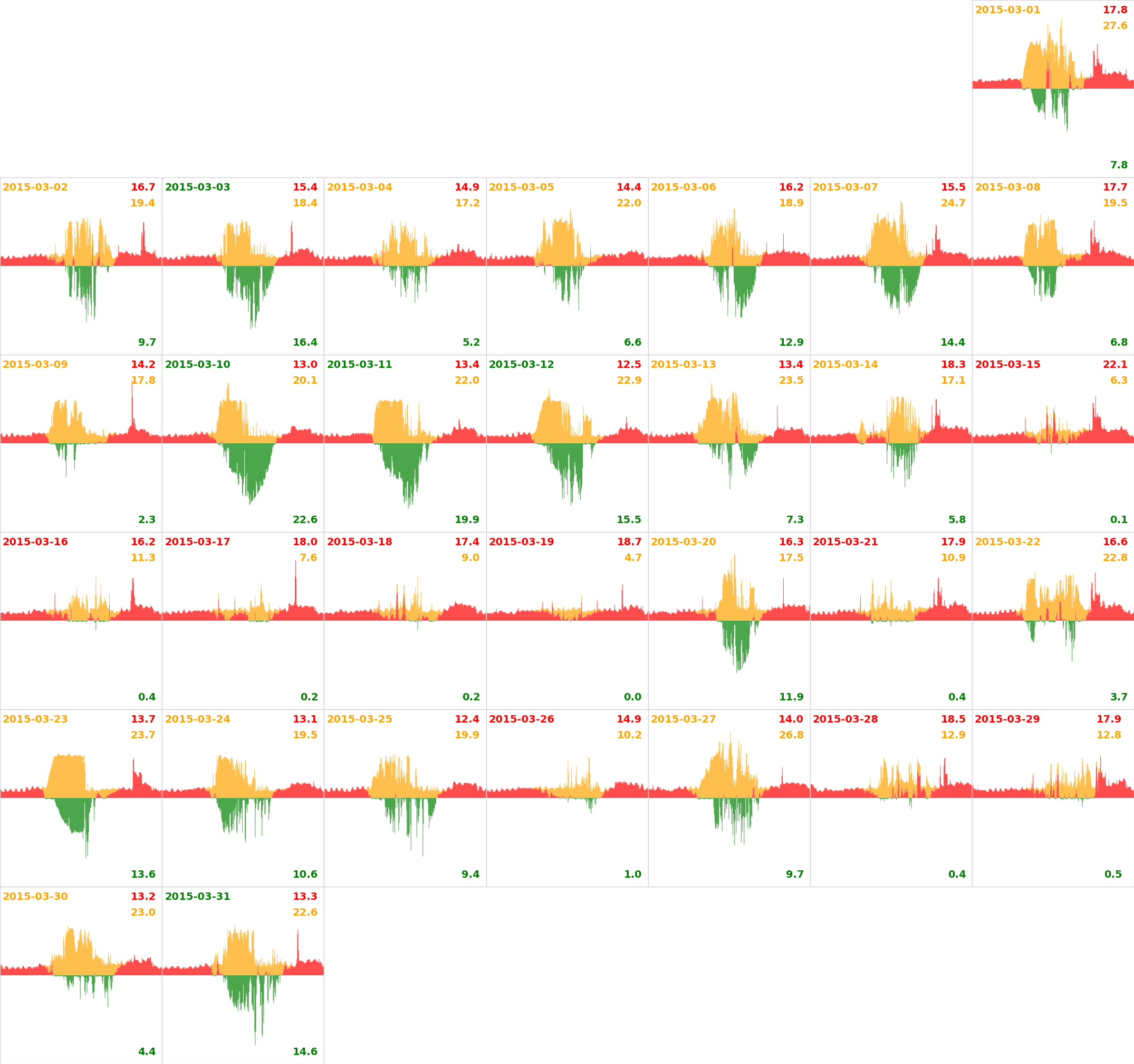
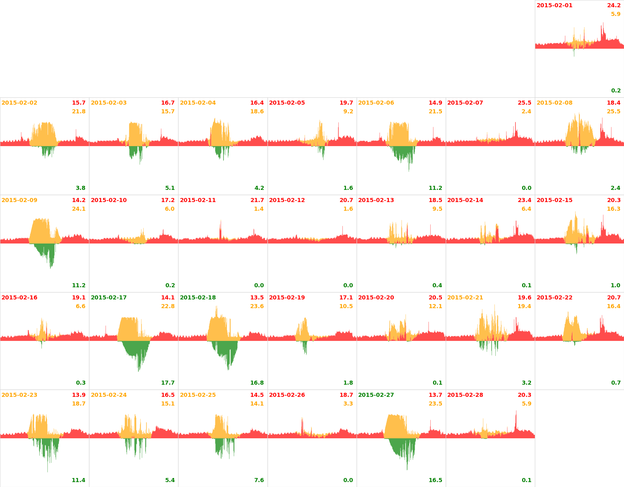
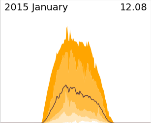
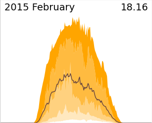
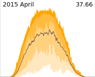
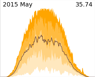
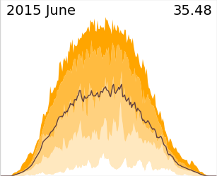
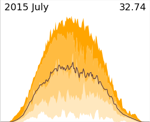
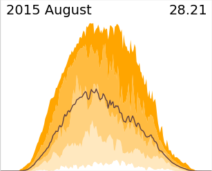
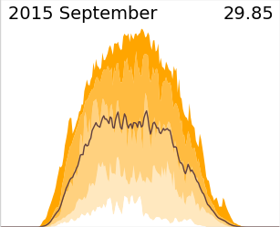
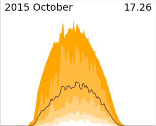
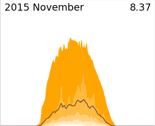
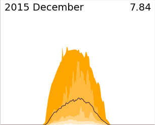
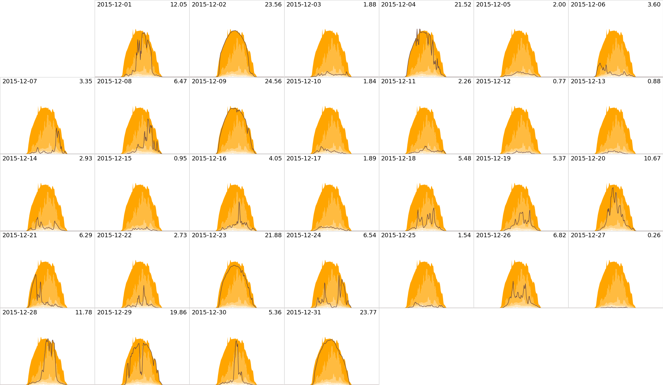
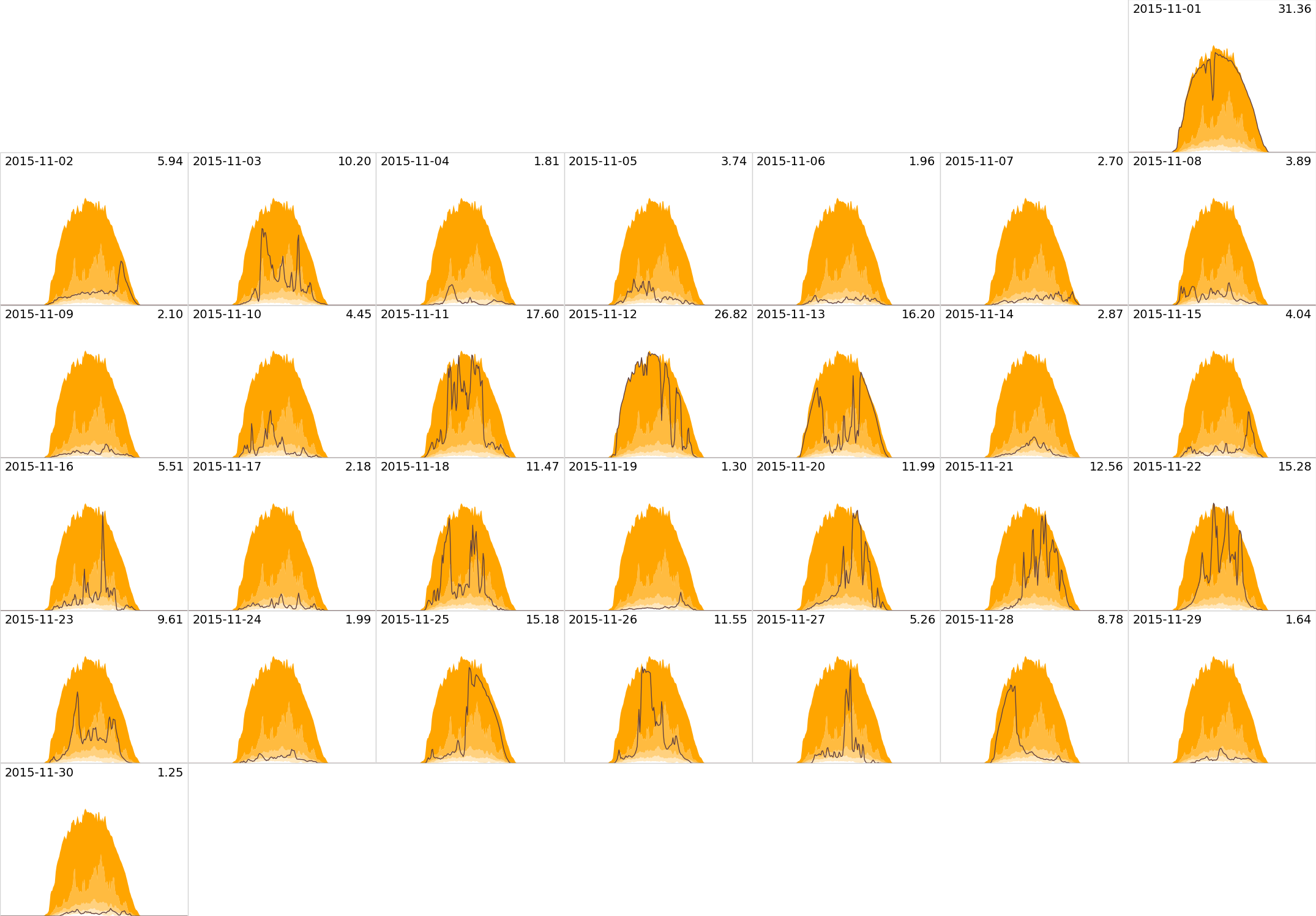
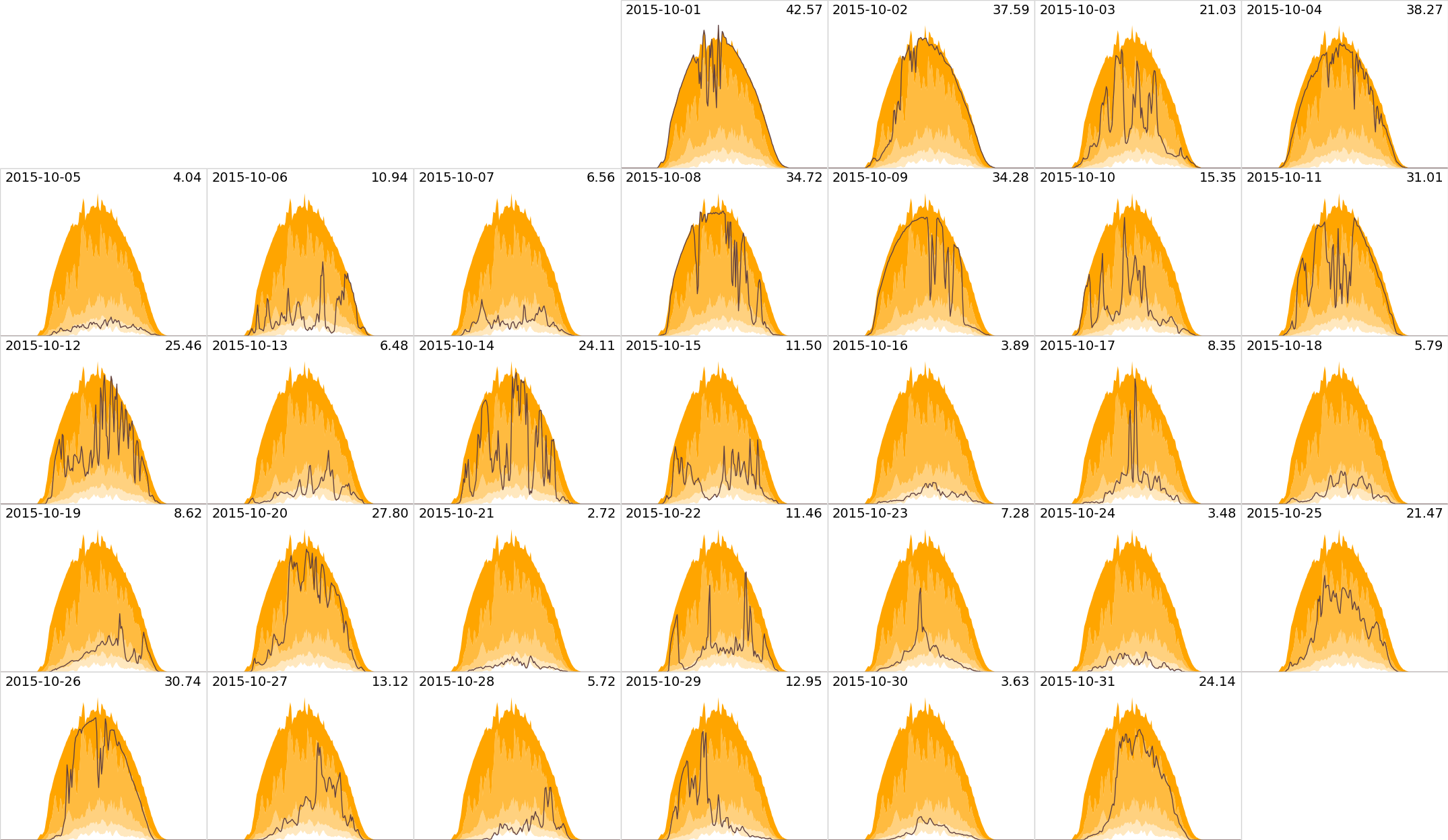
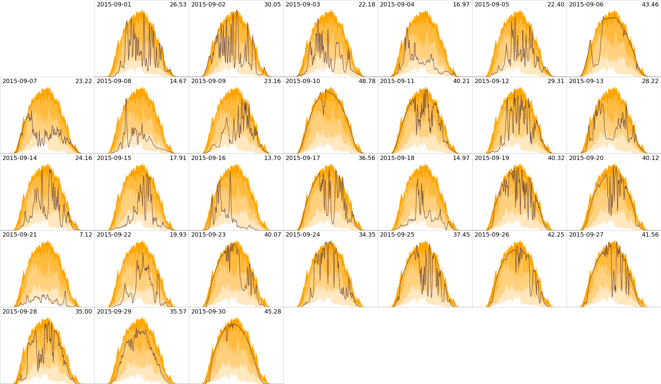
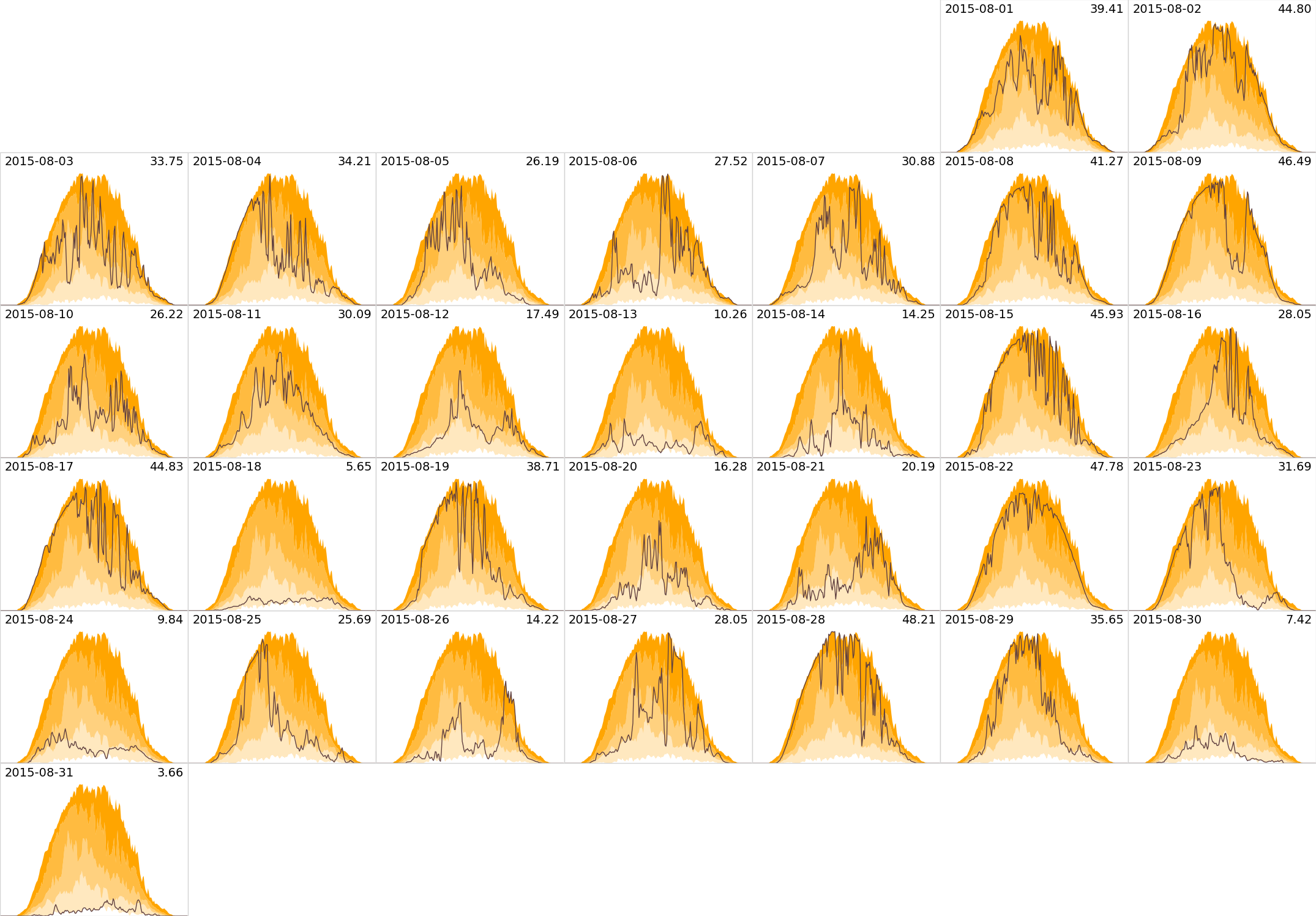
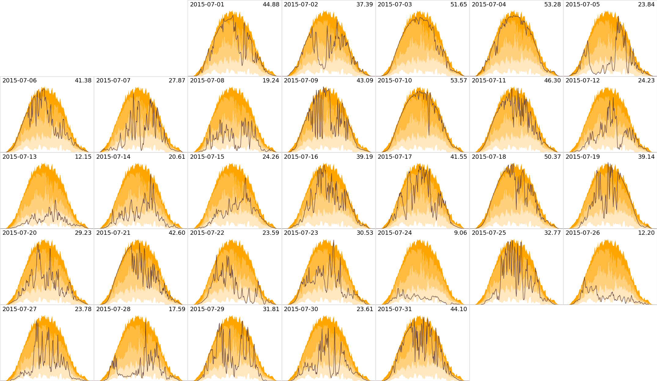
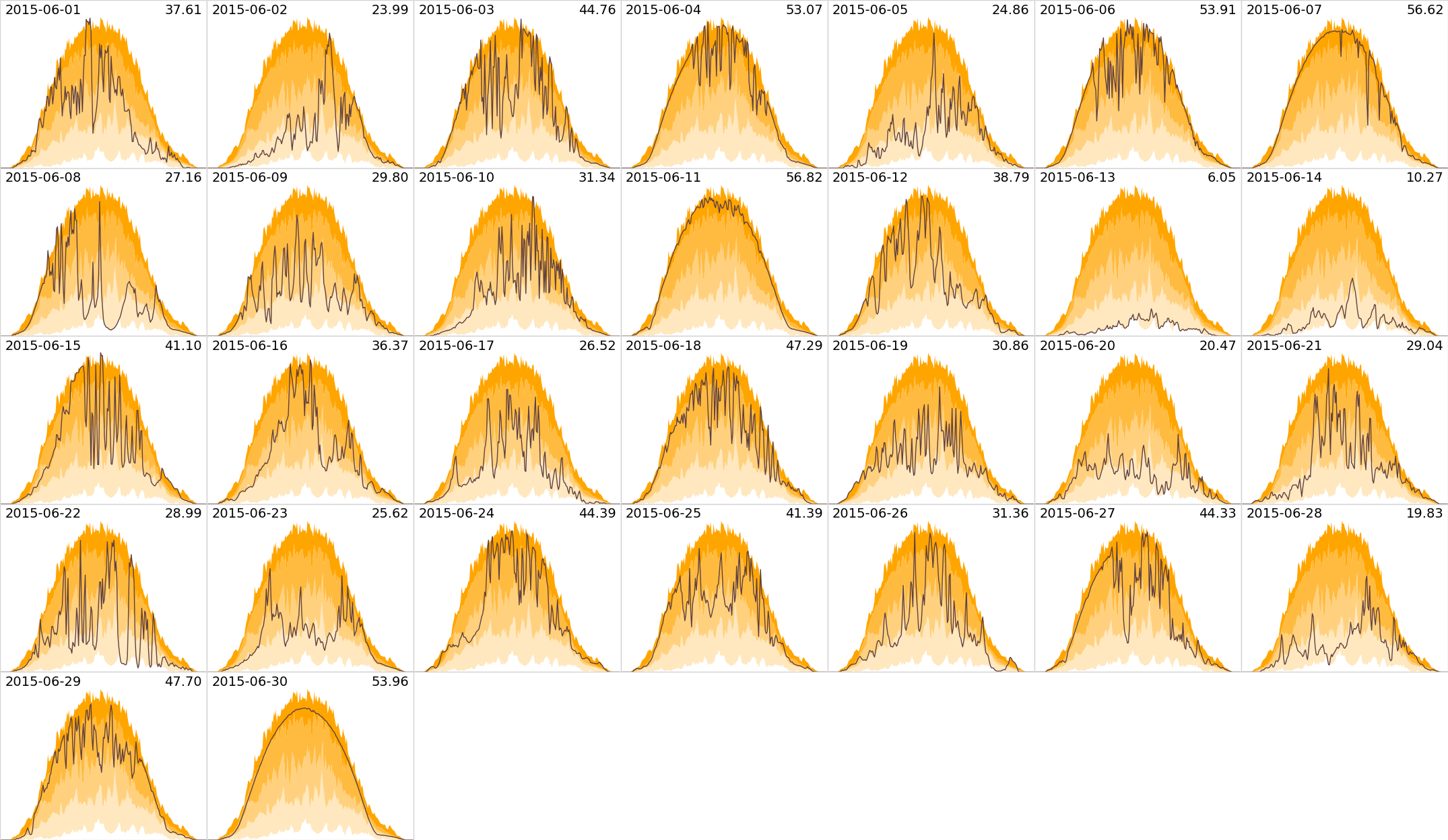
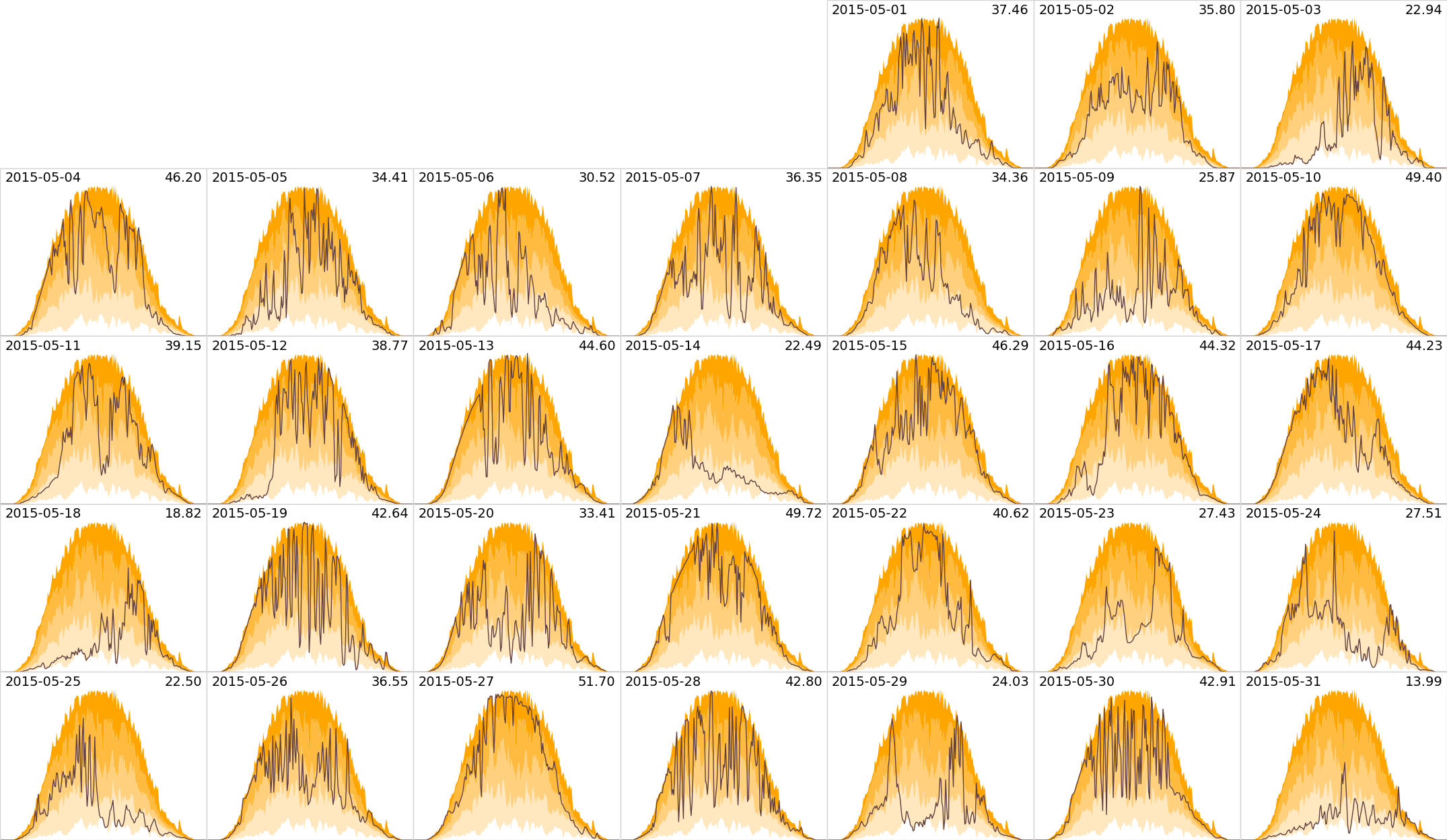
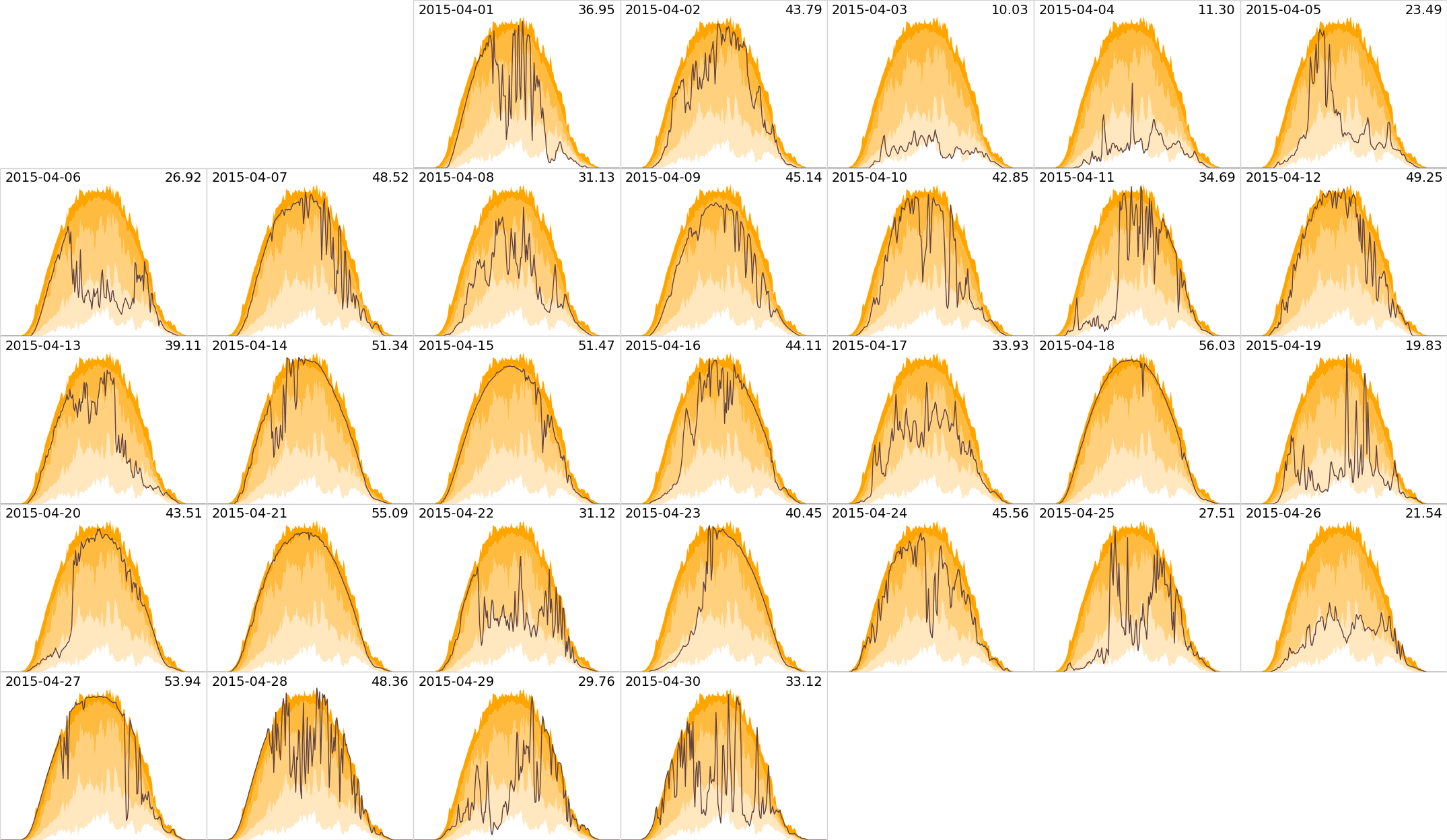
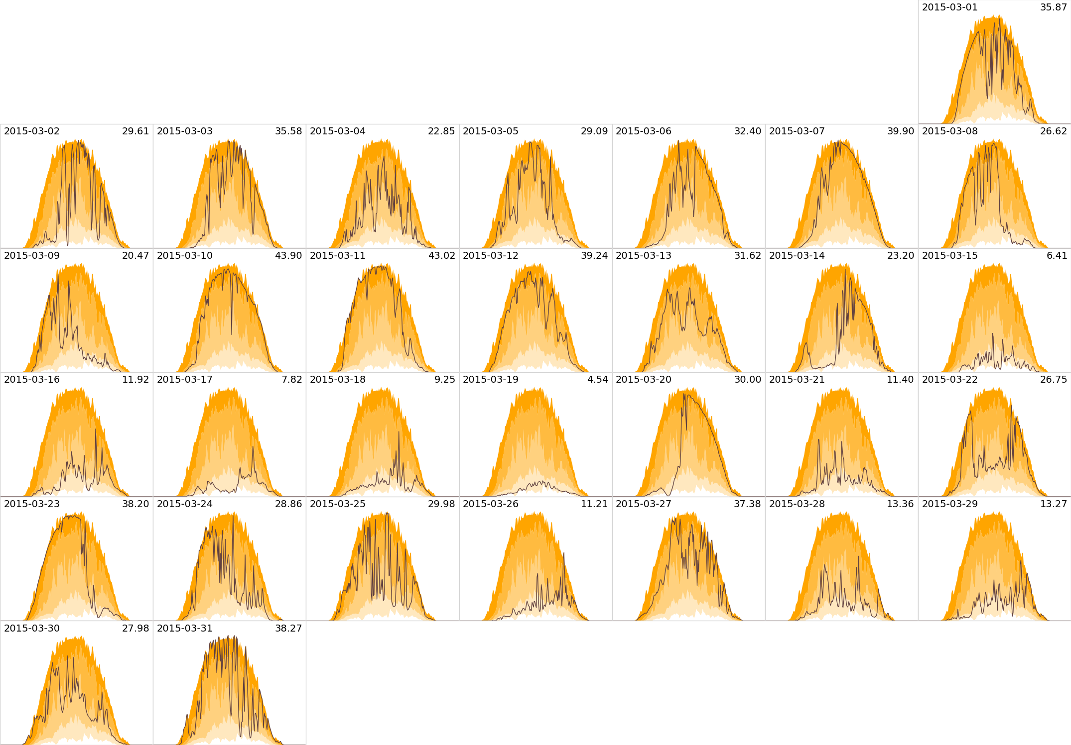
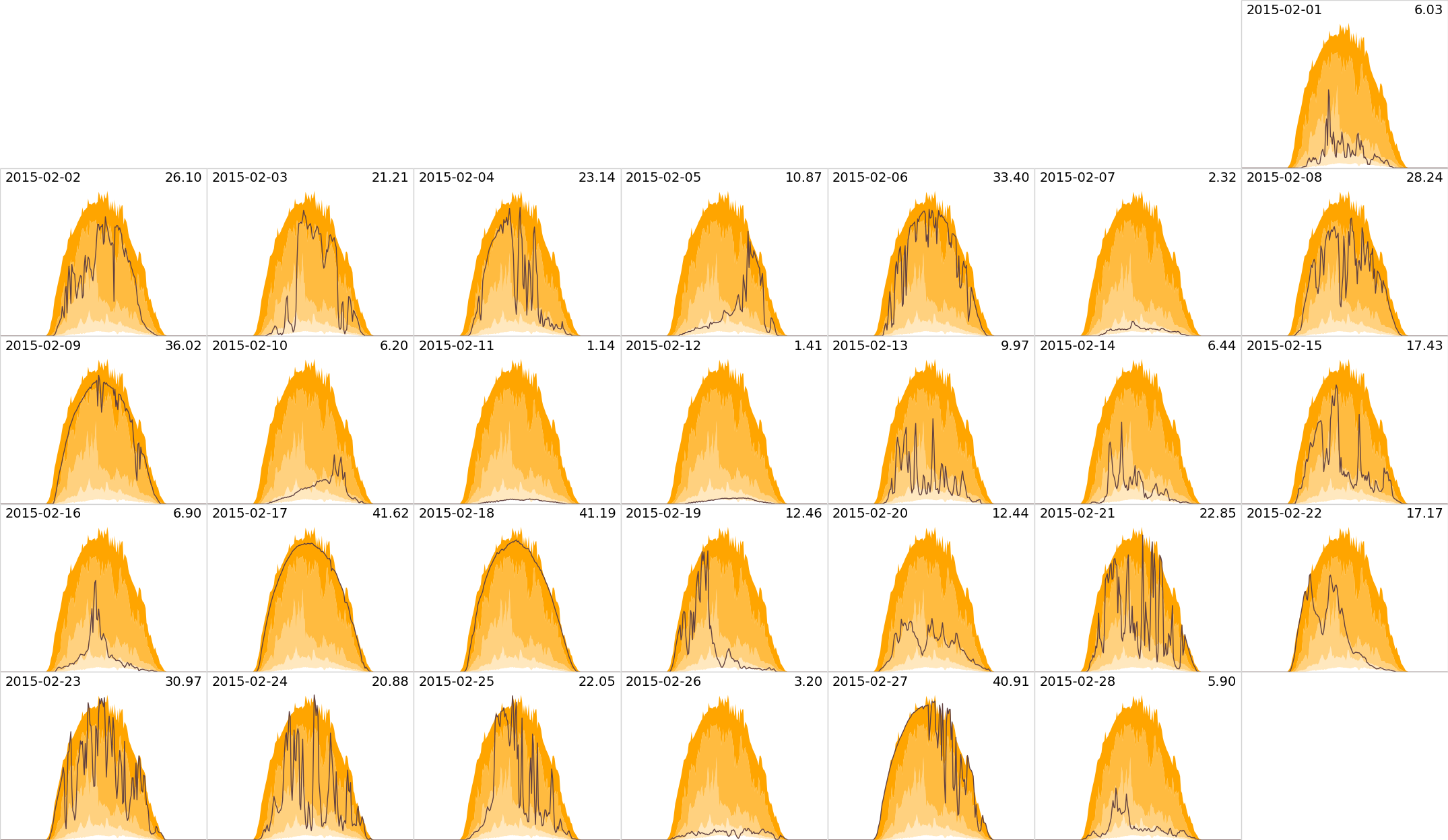
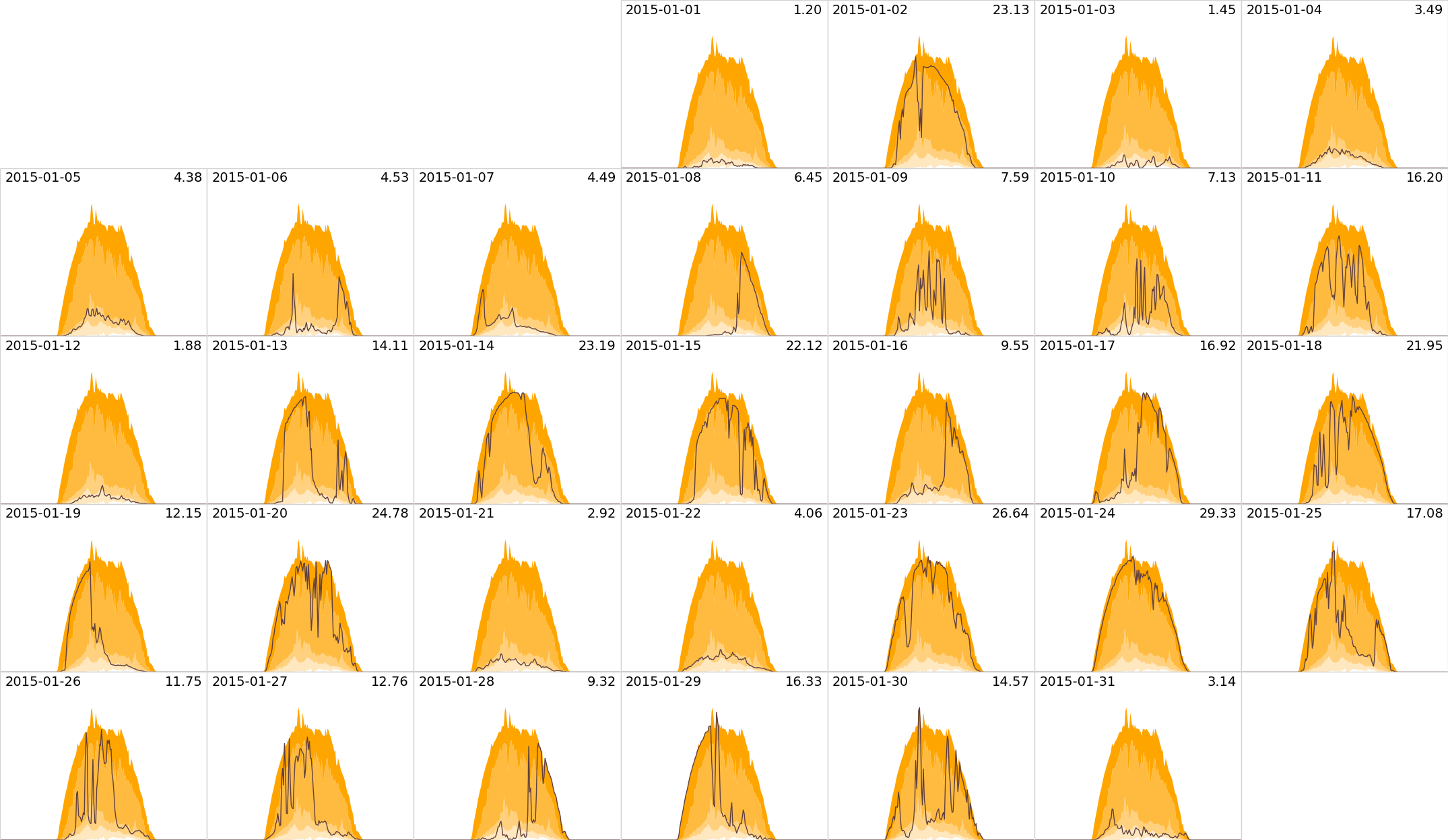
Data is gathered at 5 minute intervals. The horizontal time axis runs from 3:00am to 9:00pm GMT. The vertical axis runs from zero to 8kW. The orange regions indicate the minimum, lower quartile, median, upper quartile, and maximum generation at that time, over the month. The line indicates the actual generation at that time (or the monthly mean, for the monthly average plots). The number in the top right is the total generation in kWh that day (or the monthly mean, for the monthly average plots).
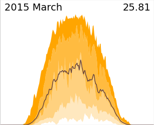
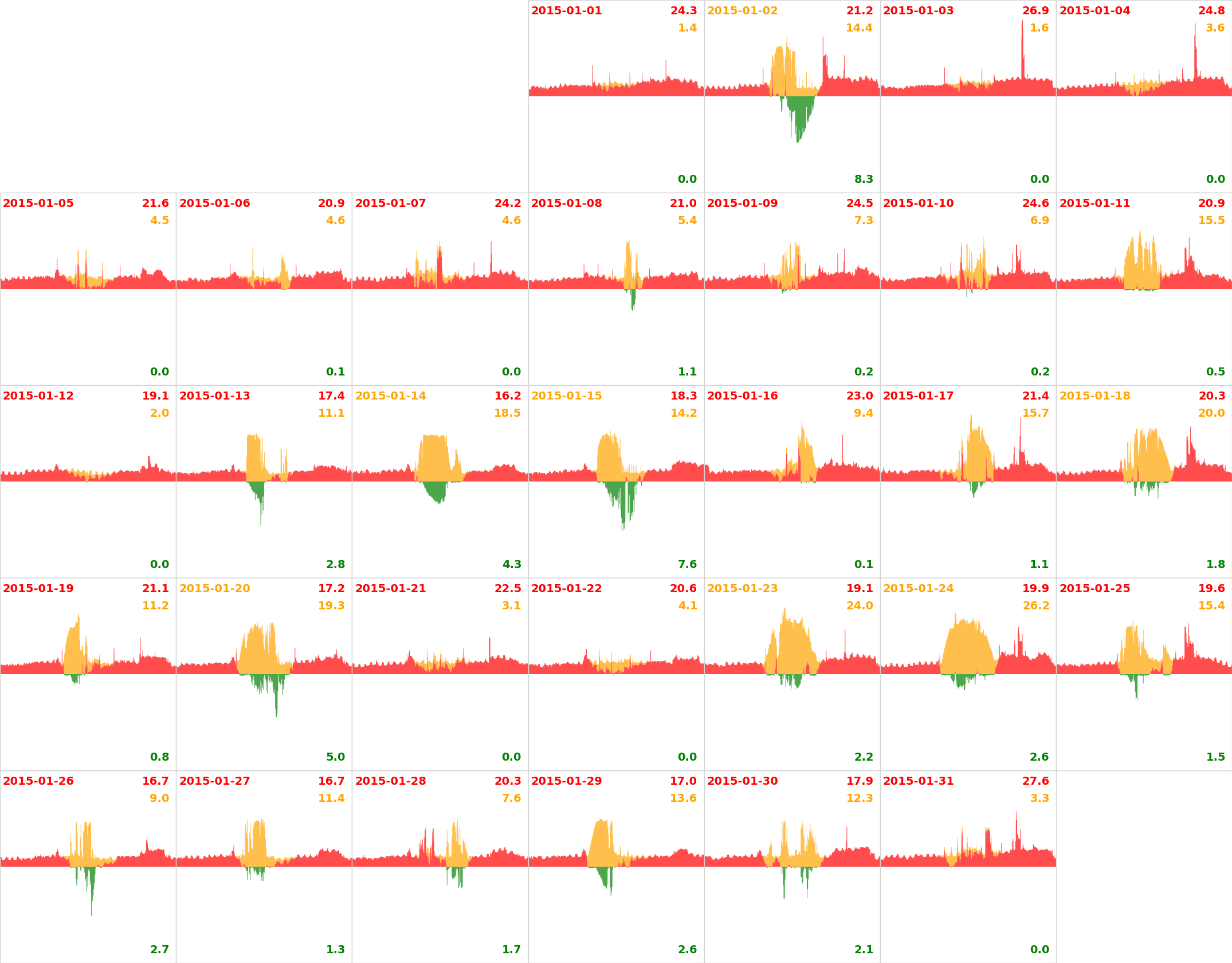
Friday 20th of March was the eclipse, about 85% where we are. The dip in the morning is due to the eclipse; the subsequent rise is due to the thick cloud later clearing.
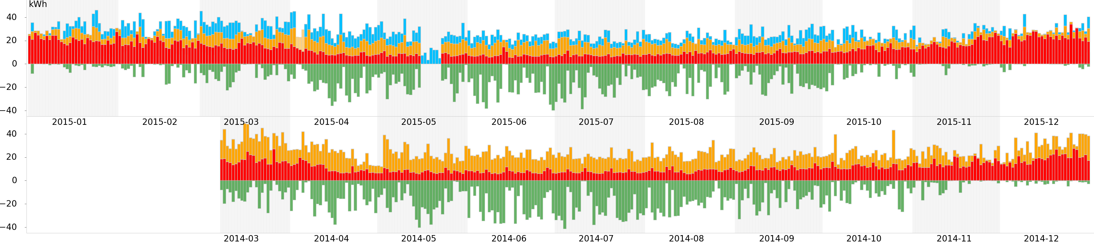
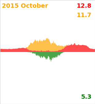
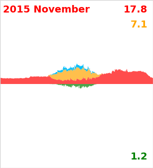
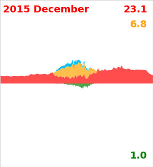
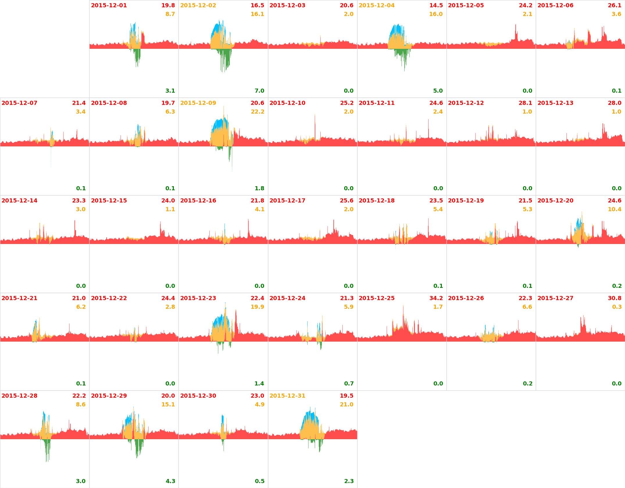
Our daily power used and export, in kWh. The region above the axis represents our usage: blue is “surplus” generated power used by the immersion heater (data on this started being collected from 1 Jan 2015); orange is the remaining ordinary generated usage (or the total generated usage in 2014); red is the extra imported from the grid. The green region below the line is surplus generation exported to the grid.
There are three days of immersion data missing in early April 2015: the (lighter) orange here represents the total generated usage. There is a week of usage data missing in May 2015: the blue is the immersion heater usage, so total generation was at least this.
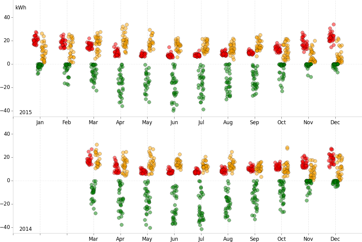
Our daily power used and export, in kWh, by month, using a jitter plot (some jitter is applied to the horizontal position, to prevent overlapping).
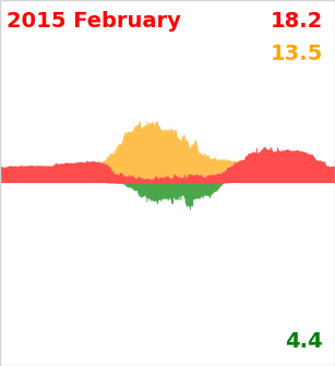
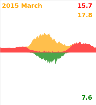
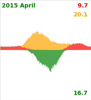
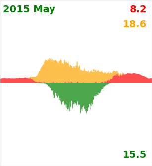
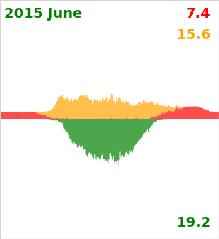
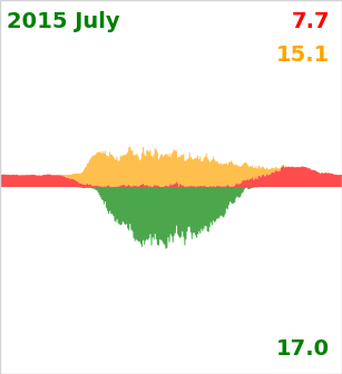
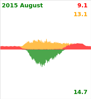
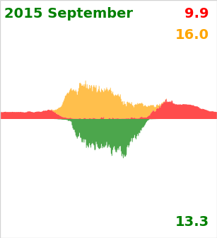
The region above the axis represents our usage: orange is generated usage, red is the extra imported from the grid. The green region below the line is surplus generation exported to the grid.
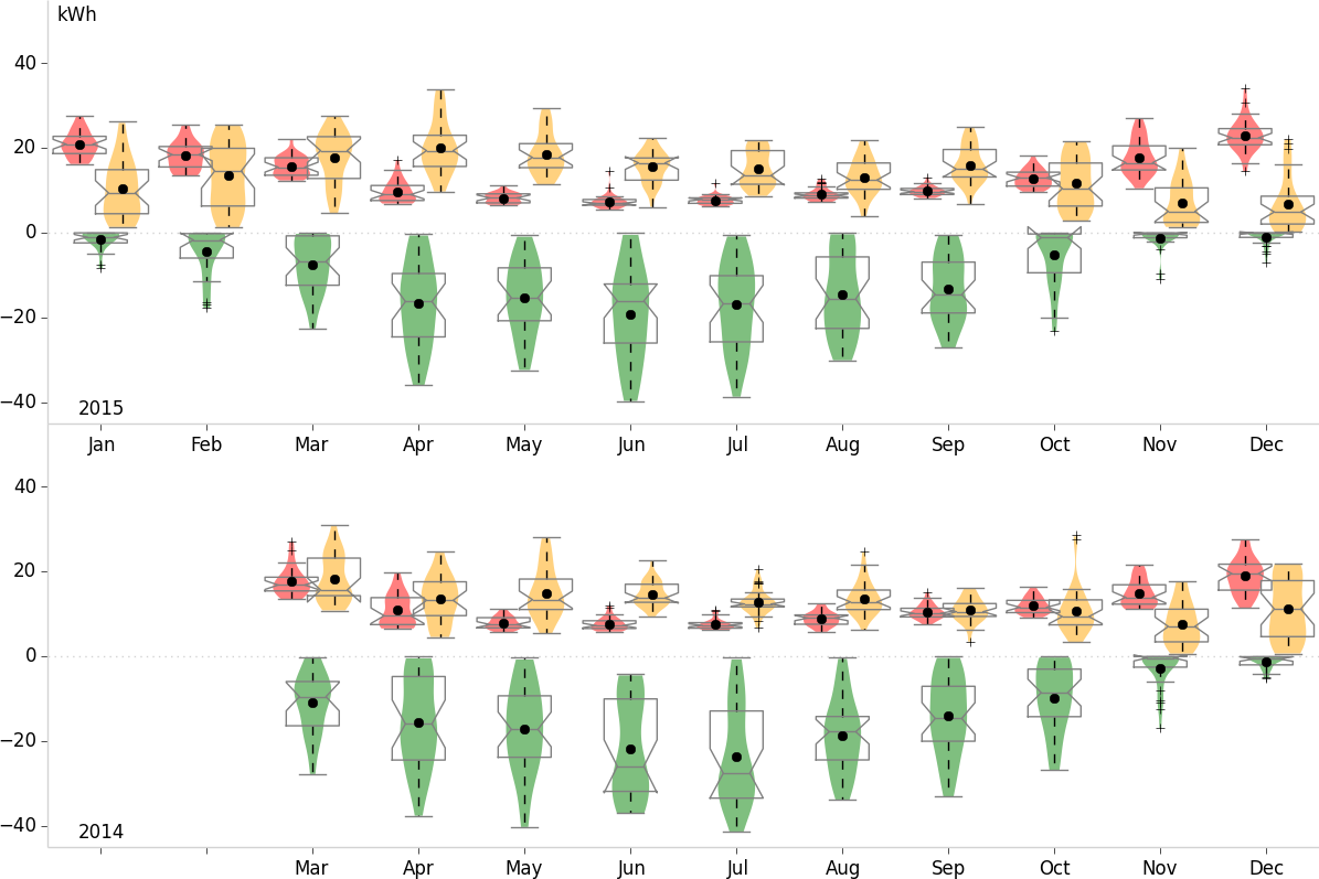
Our daily power used and export, in kWh, by month, using violin plots (a notched box and whisker plot—where the box shows the inter-quartile range, with 95% confidence interval notches; whiskers show data within 1.5*IQR—plus a kernel density plot). The final, partial, month tends to have larger notches, because it has less data.
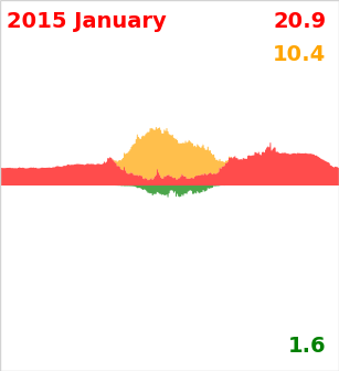
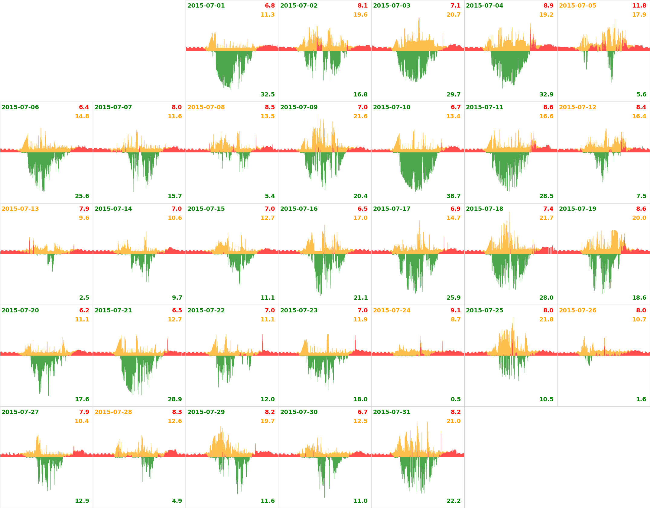
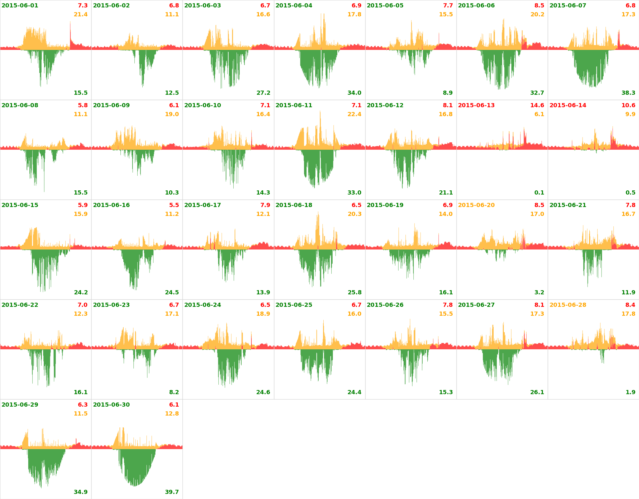
Data is gathered at half minute intervals from the Wattson meter. The horizontal time axis runs from midnight to midnight GMT/BST. The vertical axis runs from -8kW to 8kW. The region above the axis represents our usage: orange is generated usage, red is imported from the grid. The green region below the line is surplus generation exported to the grid. Numbers are in kWh; #orange + #green = the total generated. This is slightly different from the other power generation totals, since it is being recorded by a separate, and less accurate, meter.
On the daily plots, you can see specific usage. The big early morning generated usage is from the immersion heater. The early evening spike at the weekends is dinner being cooked in the electric oven; during the week we usually use the gas hob.
On “green date” days, the green area is greater than the red area (#green > #red), meaning we export more than we import, so are nett generators. The rest are days where we import more than we export, taking more from the grid than giving back. On “orange date” days, we still generate more than we import, but use enough of it that we are not nett exporters. On “red date” days we import more than we generate; but even so, may still export a little during the day.
The situation is actually greener than this implies: some of that orange usage of generated power is being used to heat our water, thereby saving gas consumption, too. From 1 Nov 2015 we started collecting data on how much power is being sent to the immersion hearter during the day: this is shown as blue on the plots. So after 1 Nov 2015, orange represents generated usage in all but the immersion heater.
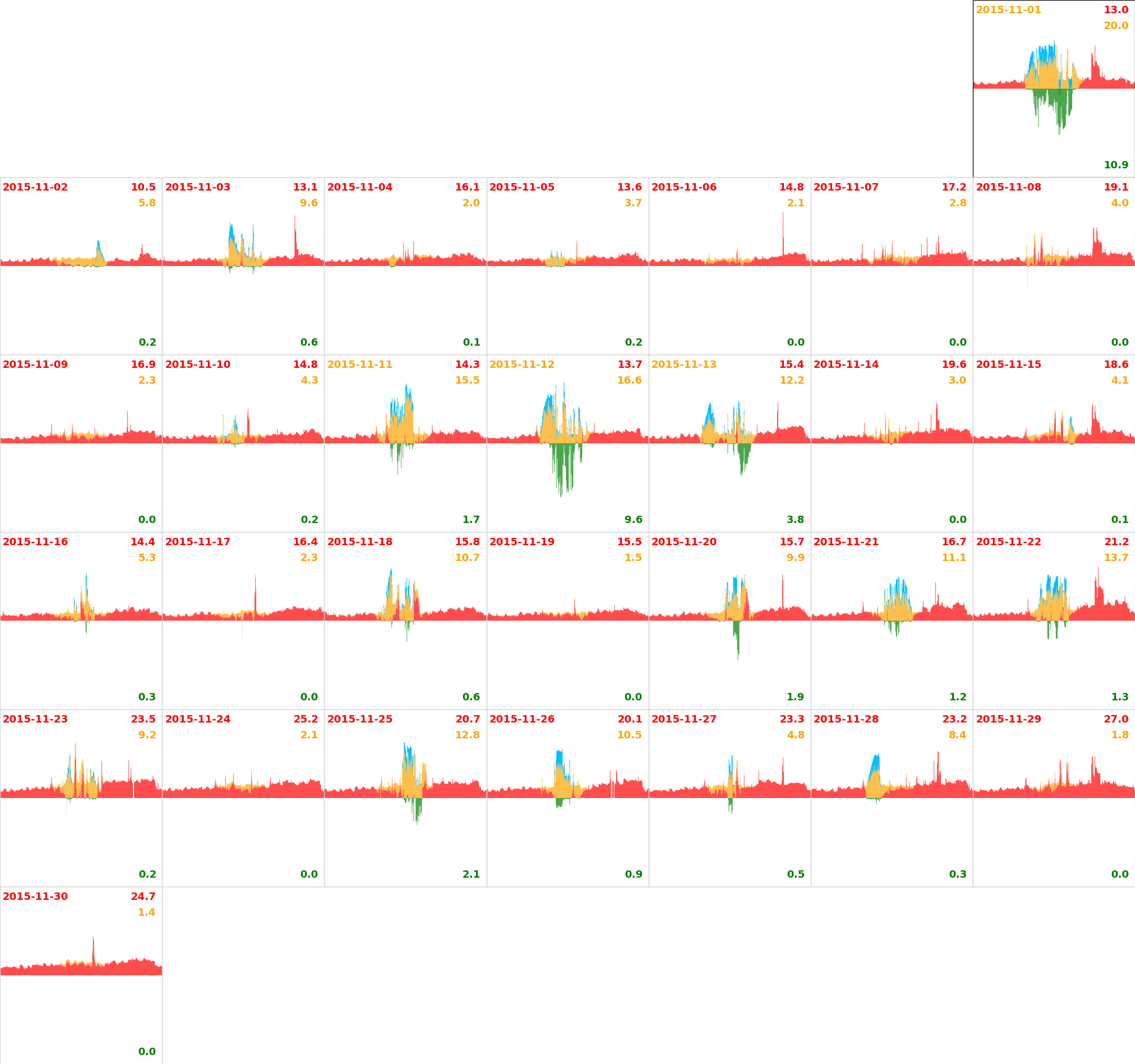
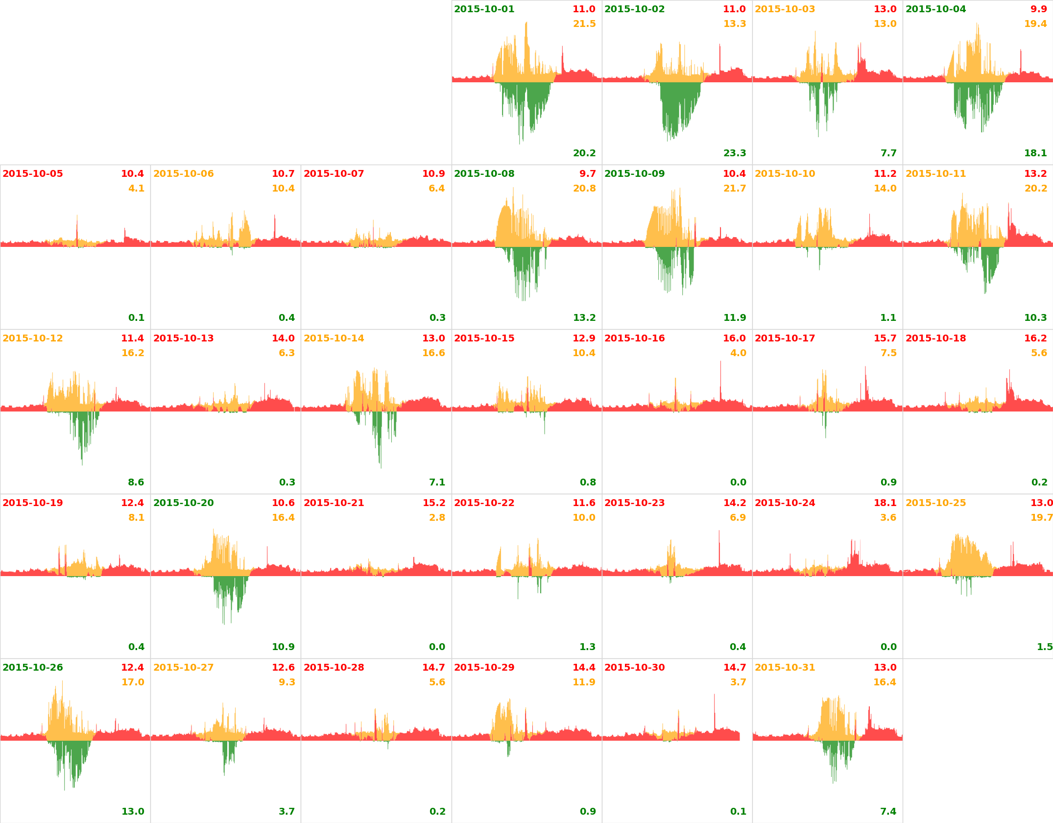
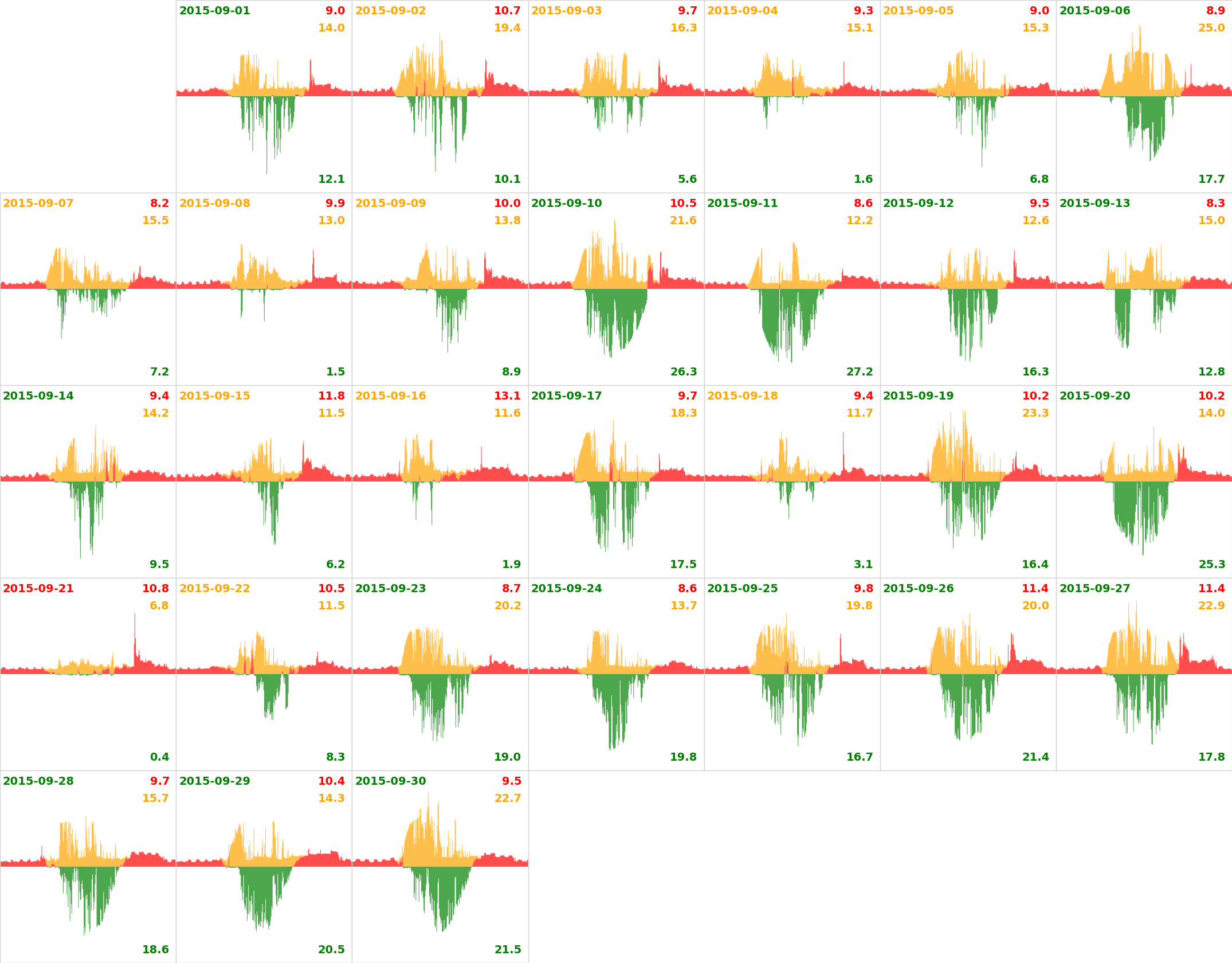
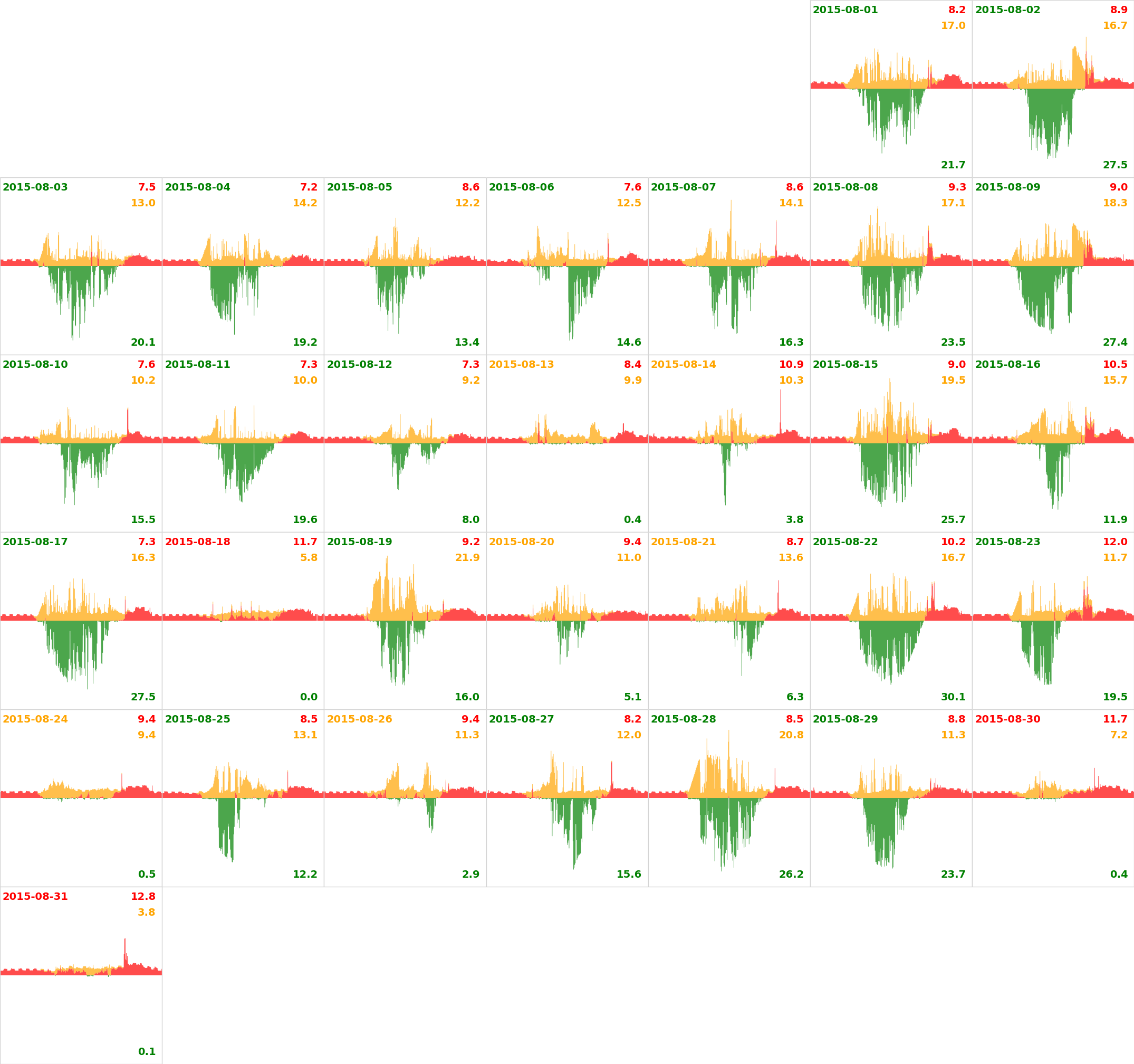
There is a week of usage data missing due to issues with the measuring system.